Audacity 4 Ditches Its Mess. Can You Ignore That Logo?
Audacity just revealed its version 4 redesign. The software looks fantastic. The logo? Not so much.
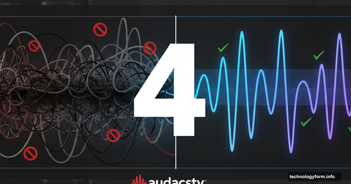
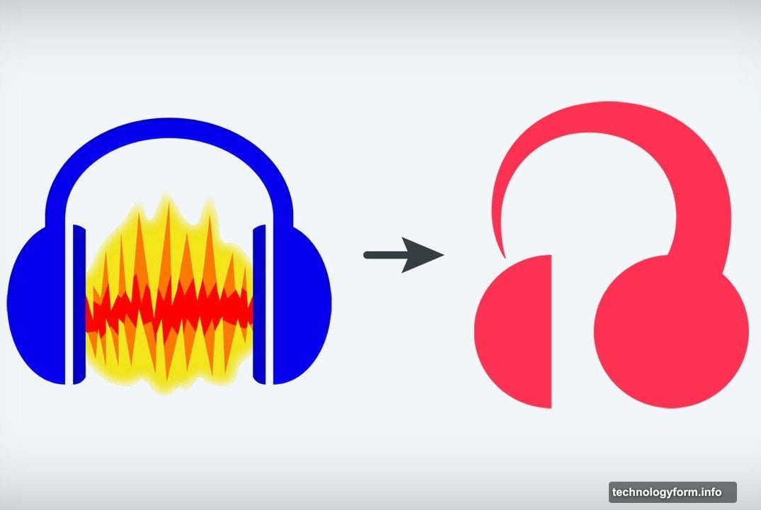
Over 25 years, Audacity evolved from a simple audio editor into a confusing maze of menus and modes. Now the team at Muse Group wants to fix that. But first, they gave it a new logo that looks like someone stepped on the Apple Music icon.
Let’s be honest. The internet roasted this rebrand immediately. The font works fine. But that headphone icon? One colleague summed it up: “Trying to decide if their new logo looks like a sperm, and mostly coming up with yes.”
Still, ignore the branding for a minute. Version 4 actually solves real problems that frustrated users for decades.
Audacity Finally Says Yes
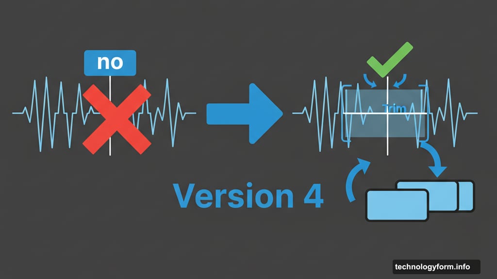
Martin Keary, VP of product at Muse, posted a detailed video explaining what changes. The biggest improvement? Eliminating what he calls “Audacity says ‘no'”.
These are moments when Audacity blocks basic actions. No explanation. Just a pop-up saying you can’t do something.
For example, try dragging a clip past another clip. It hits a brick wall. Want to paste audio where there’s not enough space? Blocked. Need to select multiple clips? Nope.
Version 4 fixes this. Now the software automatically trims clips when you paste over them. Plus, those weird editing modes that limited how you interact with audio? Gone.
Practical Improvements That Matter
Beyond removing roadblocks, version 4 adds genuinely useful features.
Each track now gets its own meter. Previously, you only saw master output levels. So mixing multiple tracks required constant guesswork about individual volume levels.
Trimming and time stretching got simpler too. Just click and drag the edge of any clip. Before, you needed to hunt through menus or remember obscure keyboard shortcuts.
The split tool received an overhaul as well. Cleaning up audio now takes fewer clicks. That matters when you’re editing a two-hour podcast and making hundreds of cuts.
However, one controversial change will upset some users. The Sync Lock feature is disappearing.
Sync Lock Dies But For Good Reason
Sync Lock tried to keep multiple audio tracks aligned. The execution never worked well though.
I’ve used Audacity for years. Sync Lock confused me every single time. It locked some tracks but not others based on logic I never understood. Sometimes it prevented edits I wanted. Other times it allowed changes that broke synchronization.
Version 4 replaces this with a clearer system. The video shows how clips automatically stay aligned unless you specifically move them. That approach makes way more sense.
Plus, the interface got a major visual upgrade. It’s customizable now. The colors work better. Text is easier to read. Everything feels more modern without losing Audacity’s core functionality.
The Release Timeline
Early 2026 marks the target release date. That gives the team time to polish features and maybe reconsider the branding.
Because honestly, this redesign deserves better than that logo. The software improvements look substantial. The UX changes address legitimate complaints. The interface finally matches modern standards.
So please, Muse Group, revisit that icon before launch. Audacity 4 earned a fresh start. Don’t let a bad logo become the story instead of the actual improvements.
The software itself? Looking forward to trying it. That logo though? Maybe step away from the headphones metaphor entirely and start fresh.